Topology
The following observability features help you ensure your mesh is healthy or to quickly identify problem areas in operation. It combines topology, telemetry, traces, logs, events and definitions in a holistic view of your system.
Overview
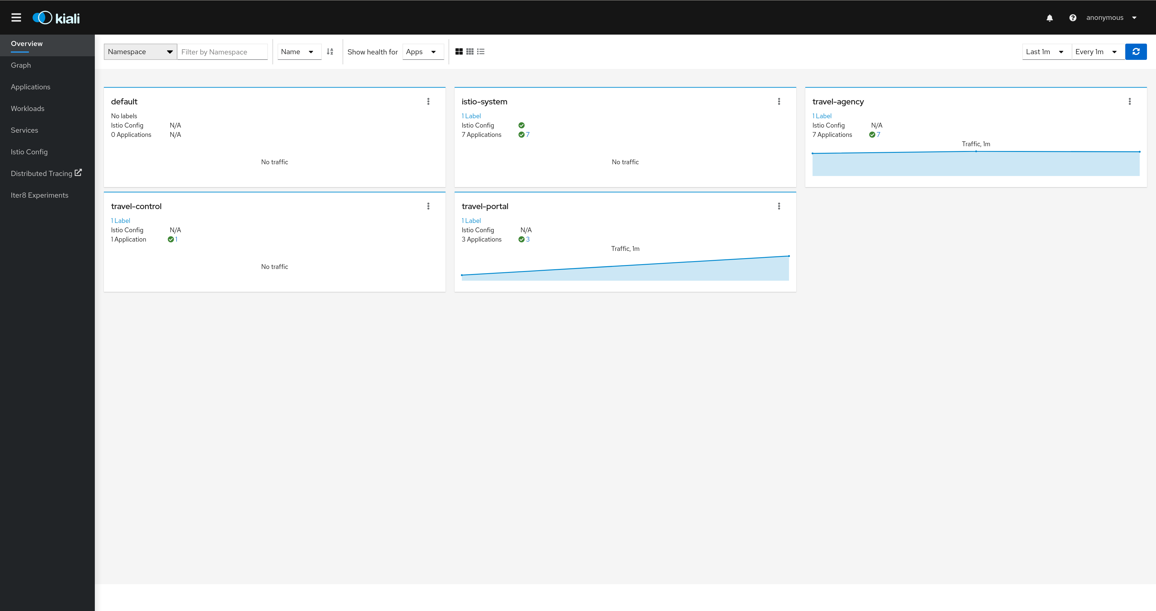
Kiali provides a summary page of the Service Mesh namespaces and the status of their Applications, Workloads and Services.
Graph
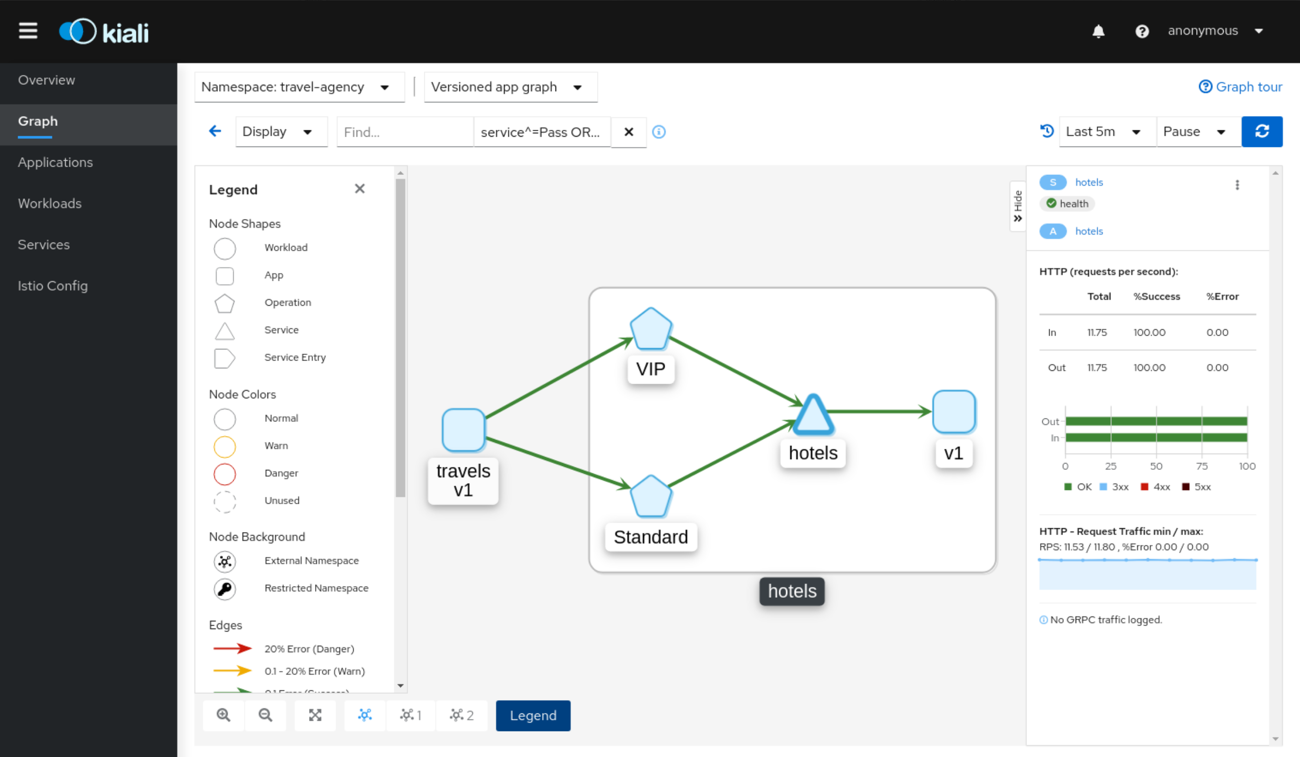
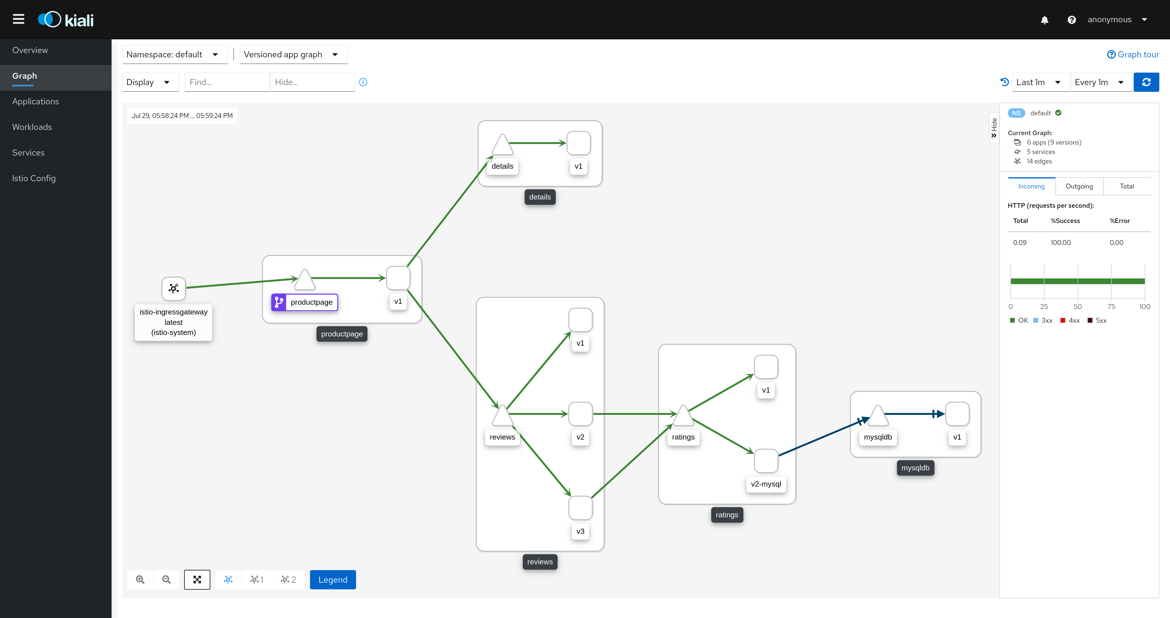
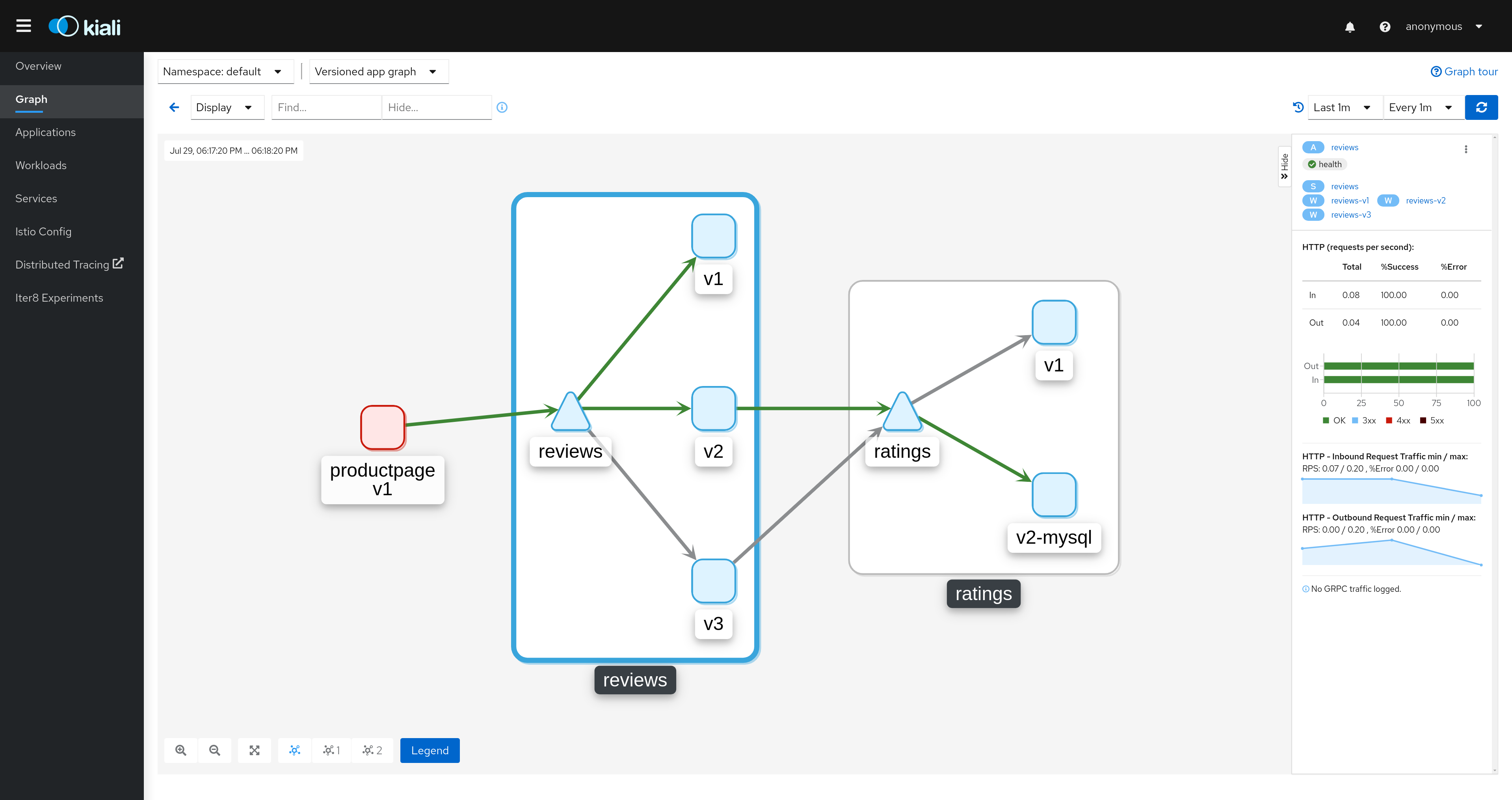
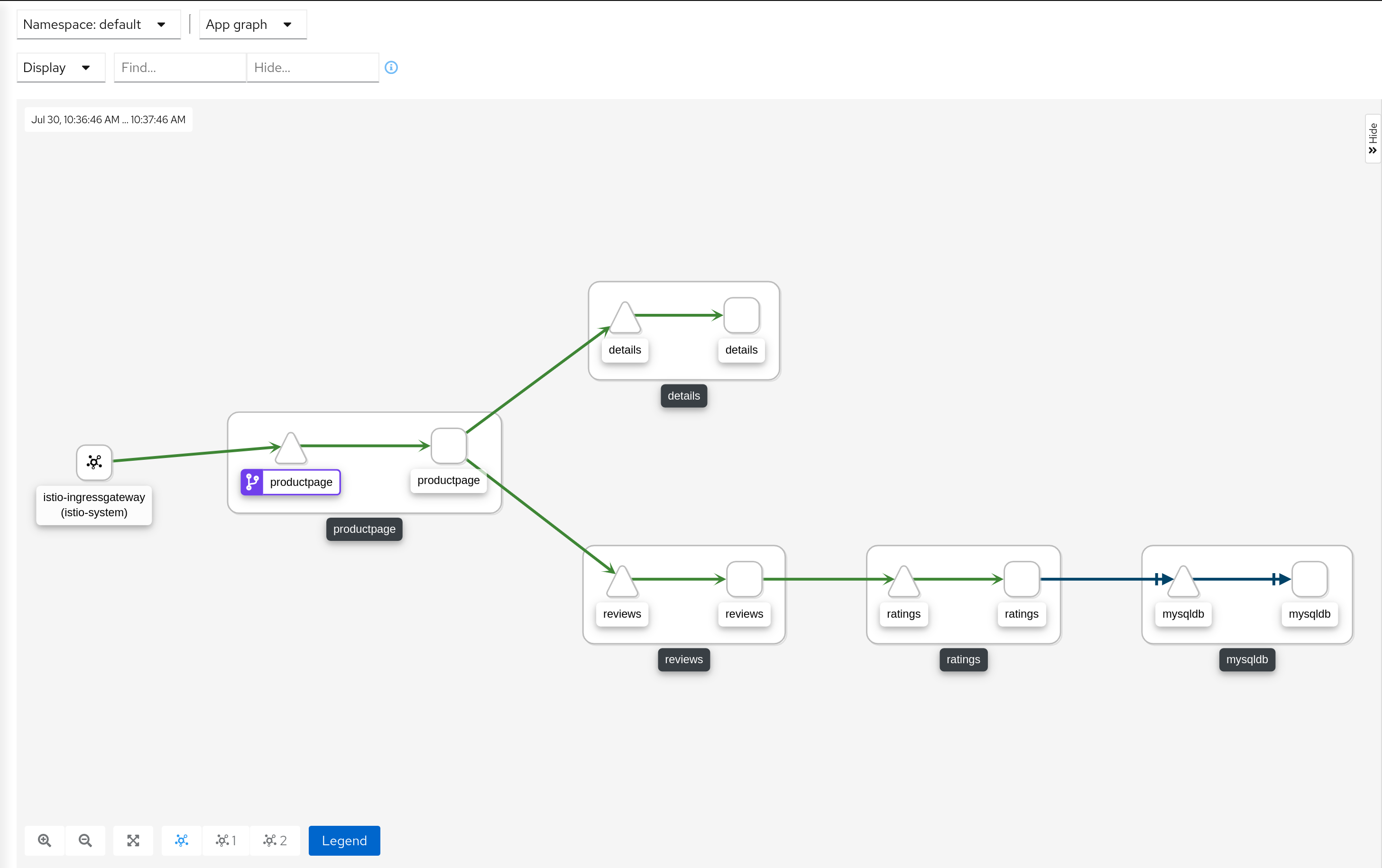
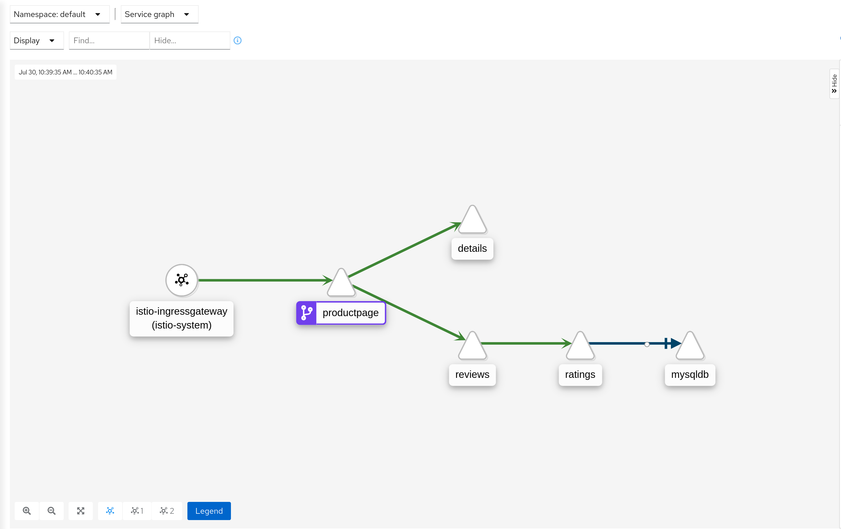
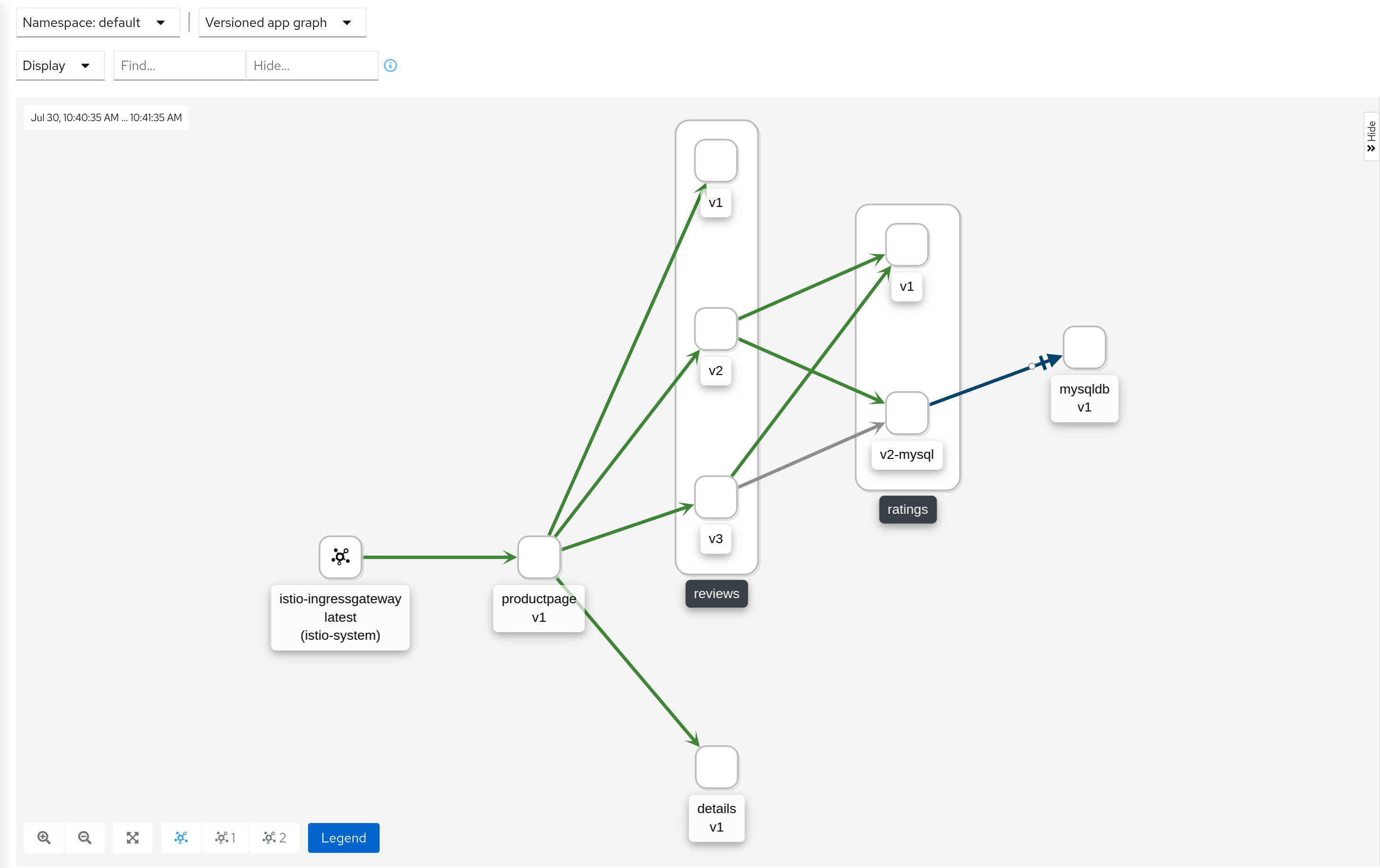
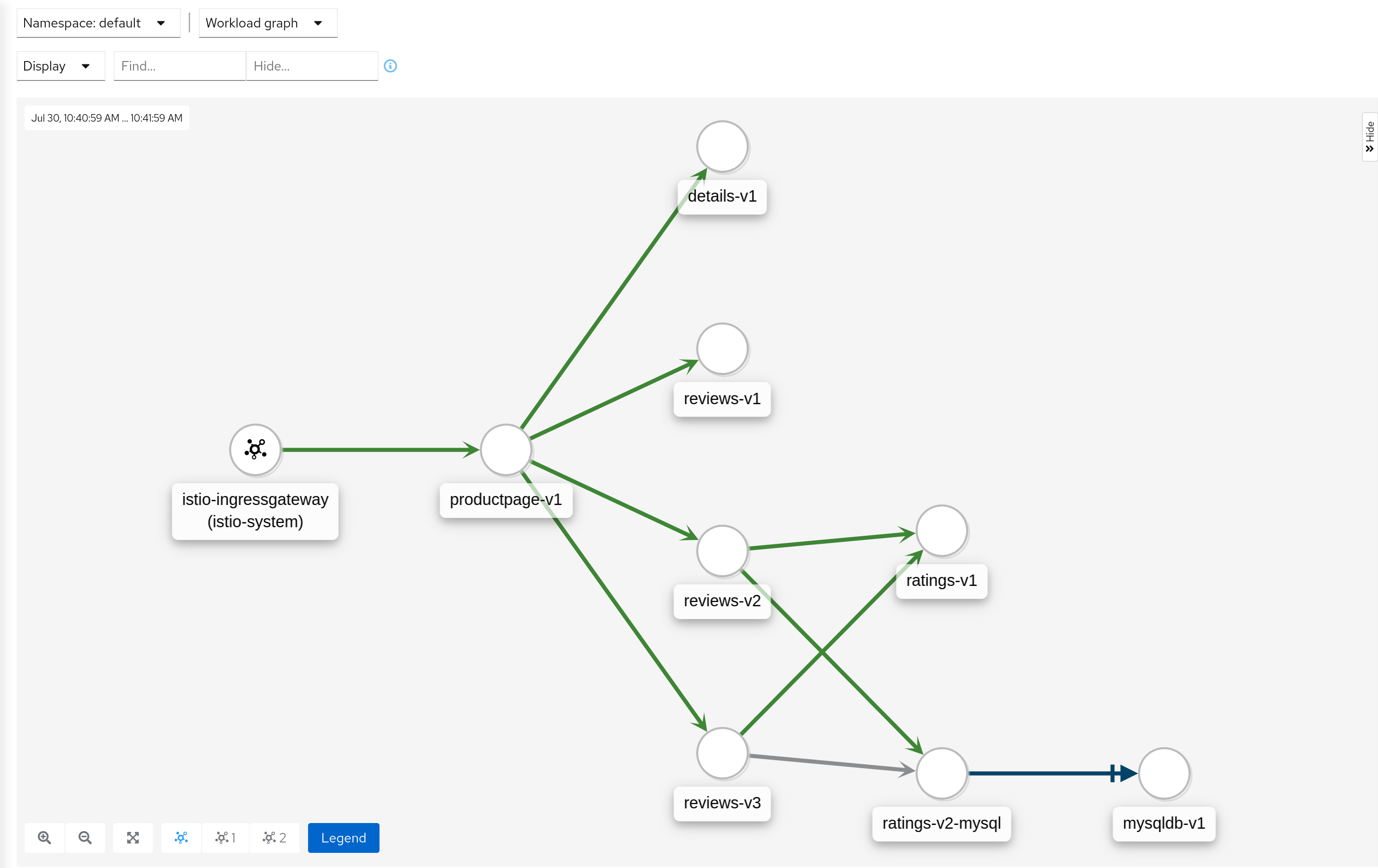
The graph provides a powerful way to visualize the topology of your service mesh. It shows you which services communicate with each other and the traffic rates and latencies between them, which helps you visually identify problem areas and quickly pinpoint issues. Kiali provides graphs that show a high-level view of service interactions, a low level view of workloads, or a logical view of applications.
The graph also shows which services are configured with virtual services and circuit breakers. It identifies security issues by identifying traffic not configured as expected. You can observe the traffic flow between components by watching the animation or viewing the metrics.
You can configure the graph to show the namespaces and data that are important to you, and display it in the way that best meets your needs.
Health
Colors in the graph represent the health of your service mesh. A node colored red or orange might need attention. The color of an edge between components represents the health of the requests between those components. The node shape indicates the type of component such as services, workloads, or apps.
The health of nodes and edges is refreshed automatically based on the user’s preference. The graph can also be paused to examine a particular state, or replayed to re-examine a particular time period.

Node Detail
You can drill down into one selected component, whether it’s a service, a workload, or an application. Kiali offers detail graphs for any node you choose.
Double click on a graph node and you can see a detailed view centered on that component. It shows you only the incoming requests being served and the outgoing requests being made - all from the point-of-view of that component’s telemetry.
You can jump back to the main graph and continue where you left off.
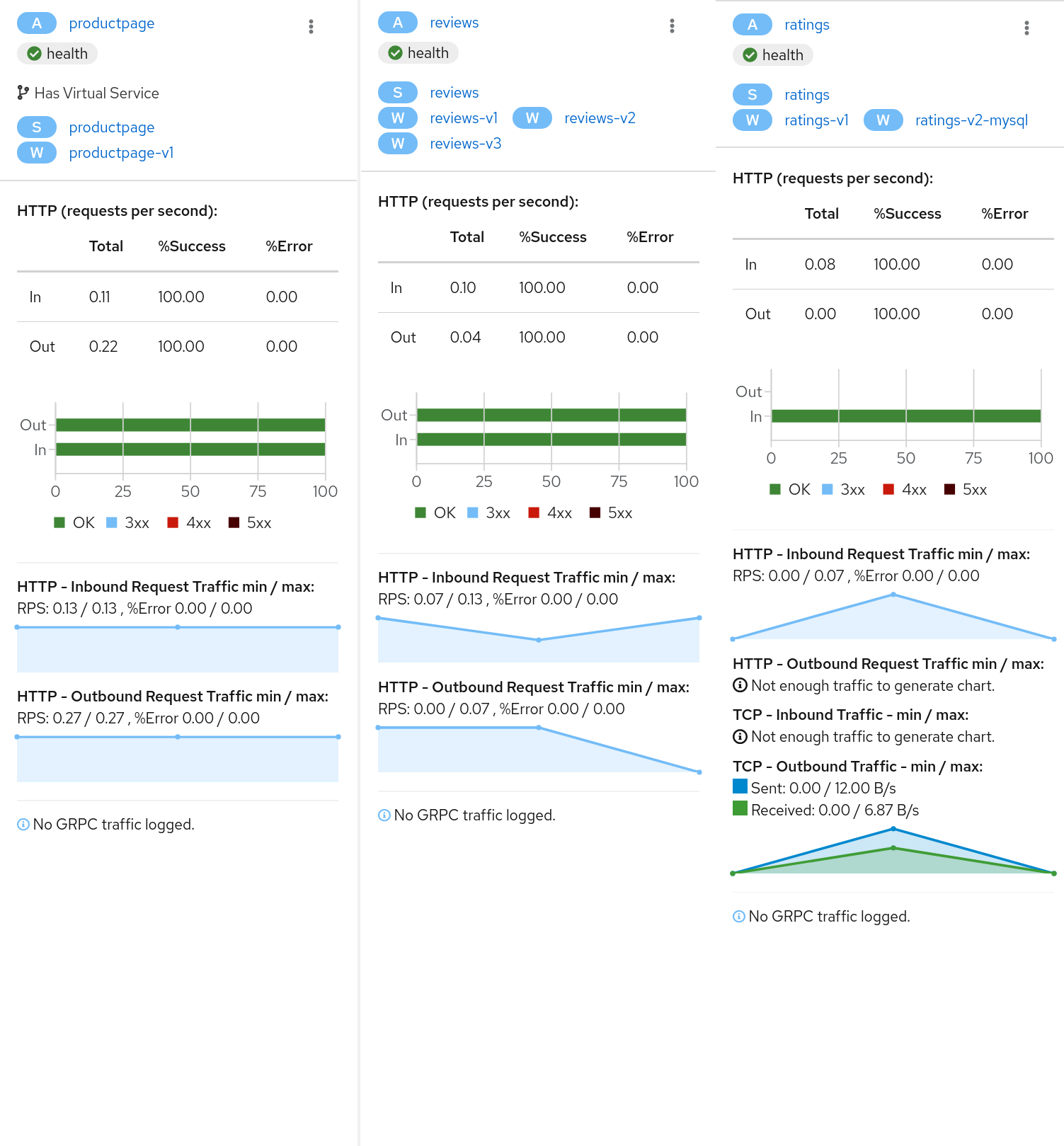
Side-Panel
Want to get a quick summary of anything in the graph? Select any node with a single-click and the side panel provides a brief summary for that component. This includes:
-
Charts showing traffic and response times
-
Health details
-
Links to fully-detailed pages
-
Response Code breakdowns.
Or, click the graph background and the side panel to view an overall summary for the entire graph.
Traffic Animation
Kiali offers several display options for the graph, including traffic animation.
For HTTP traffic, circles represent successful requests while red diamonds represent errors. The more dense the circles and diamonds the higher the request rate. The faster the animation the faster the response times.
TCP traffic is represented by offset circles where the speed of the circles indicates the traffic speed.
Graph Types
Kiali offers four different graph renderings of the mesh telemetry. Each graph type provides a different view of the traffic.
-
The workload graph provides the a detailed view of communication between workloads.
-
The app graph aggregates the workloads with the same app labeling, which provides a more logical view.
-
The versioned app graph aggregates by app, but breaks out the different versions providing traffic breakdowns that are version-specific.
-
The service graph provides a high-level view, which aggregates all traffic for defined services.
Operation Nodes
Istio v1.6 introduced Request Classification. This powerful feature allows users to classify requests into aggregates, called "Operations" by convention, to better understand how a service is being used. If configured in Istio the Kiali graph can show these as Operation nodes. The user needs only to enable the "Operation Nodes" display option. Operations can span services, for example, "VIP" may be configured for both CarRental and HotelRental services. To see total "VIP" traffic then display operation nodes without service nodes. To see "VIP" traffic specific to each service then also enable the "Service Nodes" display option.
When selected, an Operation node also provides a side-panel view. And when double-clicked a node detail graph is also provided.
Because operation nodes represent aggregate traffic they are not compatible with Service graphs, which themselves are already logical aggregates. For similar reasons response time information is not available on edges leading into or out of operation nodes. But by selecting the edge the response time information is available in the side panel (if configured).
Operation nodes are represented as pentagons in the Kiali graph: